The Filter Bar is used to apply and display filters to a data set. It is most often used in conjunction with the Advanced Table, but is flexible enough to support different data sets and rendering methods such as in a list or grid of cards.
The Filter Bar comes paired with a complex dropdown menu that displays the available parameters to filter upon (parameter is often the equivalent of a column in a table), the available values within each parameter, the ability to enter numerical/date/time values, ranges of values, and actions to apply and clear filters from the data set.
Usage
When to use
- When displaying relevant filters and filters that have been applied to a data set.
- For common filter methods like multi-selection, single selection, numbers, dates, and times.
When not to use
- For complex query builder features.
Overlap with the Filter pattern guidance
The Filter Bar component is a successor to the Filter patterns documentation and directly supports the vast majority of filtering experiences within HashiCorp applications out of the box. New experiences should use the Filter Bar by default instead of the adhering to the pattern guidance, while already delivered features should consider migrating to the Filter Bar component.
Type
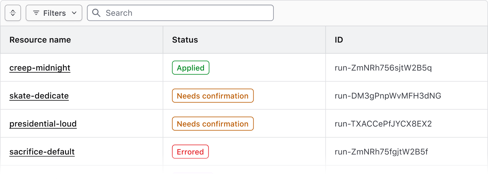
While we recommend that the Filter Bar be paired with the Advanced Table in most circumstances, the component is agnostic and can be paired with different ways of rendering a data set. To support this visually, the component features two types; attached and standalone.
Attached
Use the attached variant with the Advanced Table and standard Table.
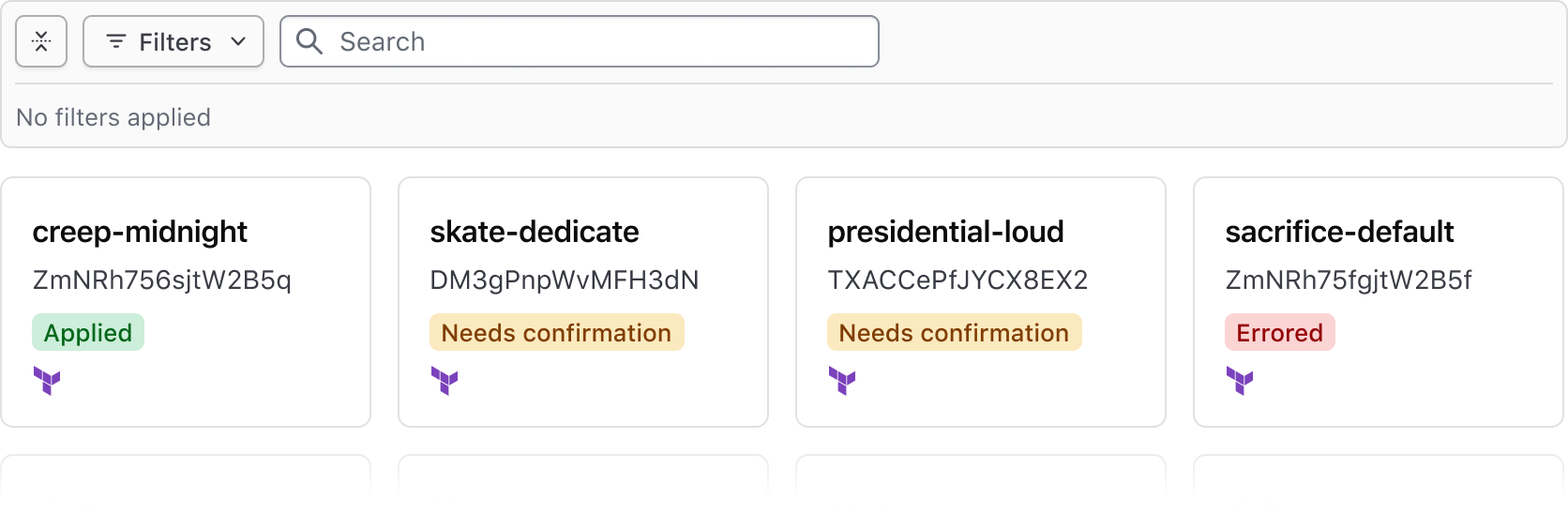
Standalone
Use the standalone variant when a data set is rendered in formats other than a table, e.g., a list or array of cards.
Expand & collapse
- The Filter Bar supports expanding and collapsing the applied filters section
- This can simplify the visual noise around the data set, especially when many filters are applied
- When no filters are applied, the Filter Bar is collapsed by default. Otherwise, if the Filter Bar is expanded, the applied filters will display an empty state.
- The Filter Bar expands automatically when one or more filters are applied
Search
Bulk actions
The Filter Bar supports bulk actions corresponding with our recommendations for multi-select within a table, and can be used to perform bulk actions such as edit, delete, and different types of selection across the data set.
![Example of bulk actions]()
Generic content
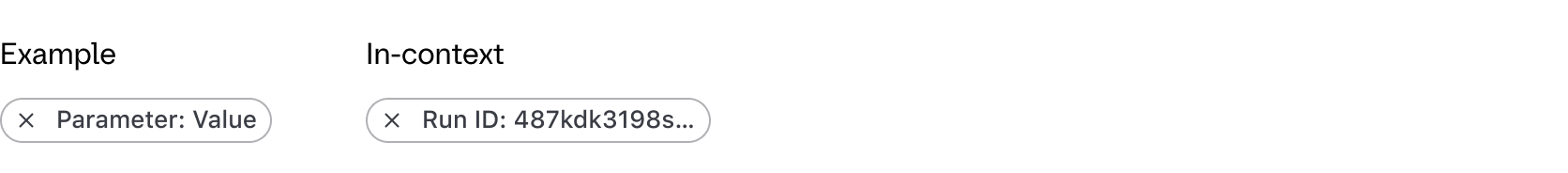
If custom functionality is needed for manipulating the view or contents of the data set, a generic block is grouped with the bulk actions in the Filter Bar. We aren't prescriptive about what can be passed to this generic block, but it should generally be limited to additional actions (as Buttons) and Dropdowns with multiple grouped actions.
![Example of generic content]()
Applied filters
Applied filters are represented within a Tag displaying the filter parameter (the category or column the filter corresponds to) and the filter value (corresponding with the specific cell content).
Tag truncation
Filter dropdown
Methods
Multi-selection
Single-selection
Numbers
Dates & times
Method options
Filter ranges
Search across filter values
Applying Filters
Clearing filters
Empty state
How to use this component
<Hds::FilterBar @filters={{this.filters}} as |F|>
  <F.Dropdown as |D|>
    <D.FilterGroup
      @key="name"
      @text="Name"
      @type="multi-select"
      as |F|
    >
      <F.Checkbox @value="project-1" @label="Project 1" />
      <F.Checkbox @value="project-2" @label="Project 2" />
      <F.Checkbox @value="project-3" @label="Project 3" />
    </D.FilterGroup>
    <D.FilterGroup
      @key="version"
      @text="Version"
      @type="single-select"
      as |F|
    >
      <F.Checkbox @value="1.0" @label="1.0" />
      <F.Checkbox @value="2.0" @label="2.0" />
      <F.Checkbox @value="3.0" @label="3.0" />
    </D.FilterGroup>
  </F.Dropdown>
</Hds::FilterBar>
Component API
FilterBar
…attributes
...attributes.
Contextual components
Anatomy
Filter Bar
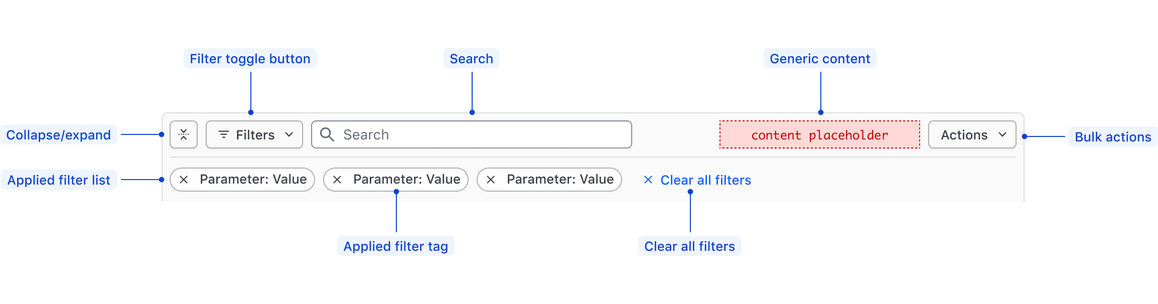
| Element | Usage |
|---|---|
| Collapse/expand | Toggles open and closed the applied filters. |
| Filter toggle button | Toggles open and closed the Filter Dropdown. |
| Search | Optional |
| Generic content | Optional |
| Bulk actions | Optional |
| Applied Filters List | Displays the filters that have been applied to the data set, or an empty state. |
| Applied Filter Tag | Displays the filter as Parameter: Value within an HDS Tag. |
| Clear All Filters | Clears all of the applied filters, sets the Filter Bar and the data set back to their default state. |
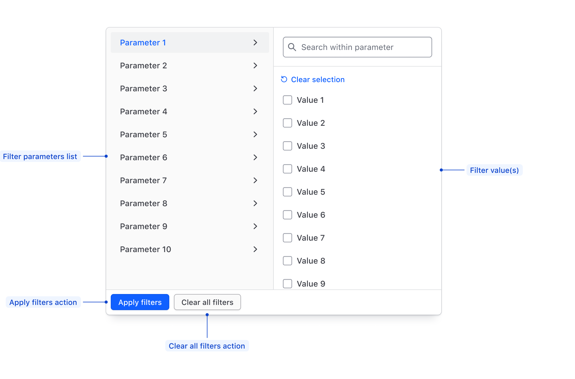
Filter Dropdown
The Filter Dropdown anatomy is dependent on the filter method and is dependent on the filtering method:
- Selection: multi-selection using checkboxes or single selection using radios.
- Input: numerical, date, time, datetime values, or a range between a start and end value.
| Element | Usage |
|---|---|
| Parameters list | Displays all of the available filter parameters, generally corresponding with columns in a table. |
| Filter value(s) | Displays available values within a parameter for selection, or allows the input of custom values. |
| Apply Filters action | Applies the filters selected in either the values list or the values input. |
| Clear all filters action | Clears the selection of filters across all parameters. |
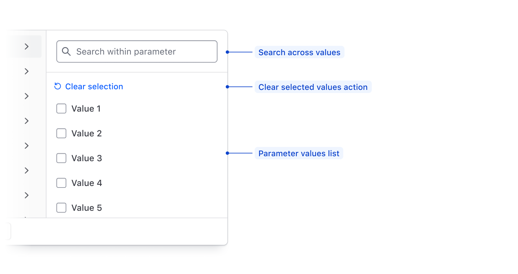
Filter value selection
| Element | Usage |
|---|---|
| Search | Searches across available filter parameter values using string matching. |
| Clear selected values action | De-selects all values in the list. |
| Value input | Allows the user to input a custom value to filter upon such as a number, string, date, or time. |
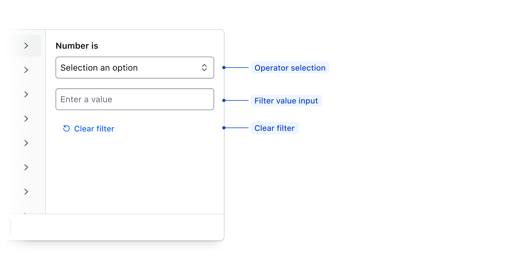
Filter value input
| Element | Usage |
|---|---|
| Operator selection | Allows the user to select how the filter is applied. |
| Value input | Allows the user to input a value to filter upon such as a number, string, date, or time. |
| Clear filter | Clears the filter operator and input fields. |
Filter value range input
When applying a filter value via an input, if Between is selected in the operator list, the input fields will be broken into a start value and end value.
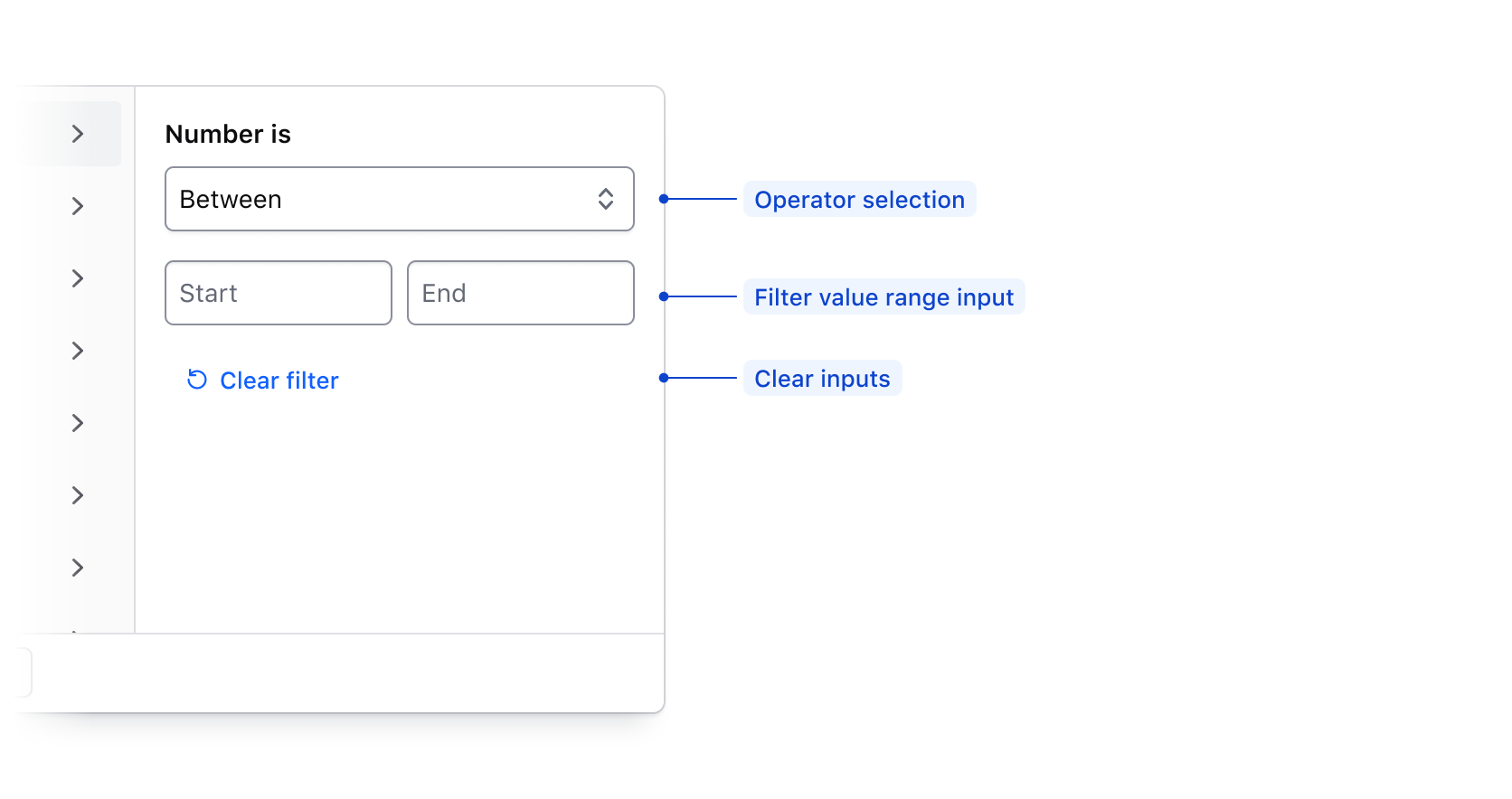
| Element | Usage |
|---|---|
| Operator selection | Allows the user to select how the filter is applied. |
| Value range input | Allows the user to input a start and end value to filter upon. |
| Clear filter fields action | Clears the filter input field. |
Value input operators
Available operators are dependent on the type of data being filtered upon, but are generally either numerical, or date/time based.
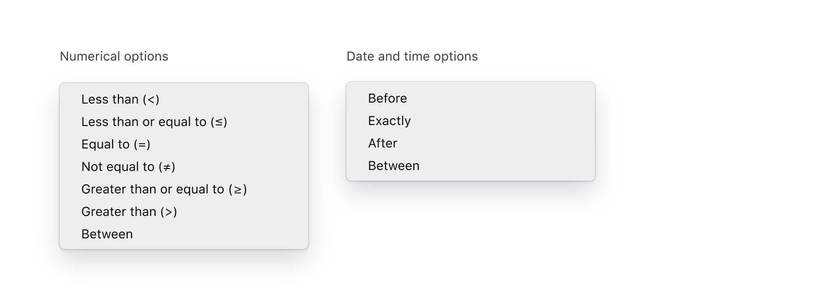
| Type | Options |
|---|---|
| Numerical | Less than (>), Less than or equal to (≤), Equal to (=), Not equal to (≠), Greater than or equal to (≥), Greater than (>), Between |
| Date and time | Before, Exactly, After, Between |
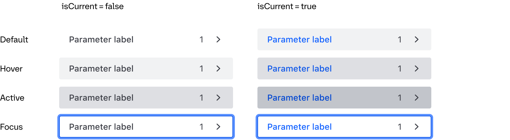
States
Parameter List Item
Conformance Rating
Applicable WCAG Success Criteria
This section is for reference only. This component intends to conform to the following WCAG Success Criteria:
-
1.3.1
Info and Relationships (Level A):
Information, structure, and relationships conveyed through presentation can be programmatically determined or are available in text.
Support
If any accessibility issues have been found within this component, let us know by submitting an issue.